01
// Problem
A bank with no shared design language
The Problem
Fragmented products.
No shared vocabulary.
When I joined Barclays in late 2019, the Group's digital products were built on fragmented, inconsistent foundations. Different teams had developed their own patterns, components, and visual approaches independently — creating a fractured experience for customers and an impossible maintenance burden for designers and developers.
There was no single source of truth. No shared vocabulary. No way to ship consistently across products without enormous duplication of effort. The absence of a design system wasn't just a design problem — it was a delivery problem, a quality problem, and a brand problem simultaneously.
01
Fragmented components
Multiple teams building the same UI patterns independently — buttons, cards, forms — with subtle differences that made the product estate feel incoherent.
02
No brand system
Photography style, typography, colour usage and tone of voice varied across products with no overarching governance or shared reference point.
03
No coded foundation
Design decisions weren't translated into a shared code library — meaning every team reimplemented components from scratch, creating divergence from day one.
02
// Pivot
Adoption is the design challenge. Not the system itself.
The Insight
A design system is only as valuable as its adoption. Building it is the easy part. Making it the path of least resistance for every team — that's the real design challenge.
— Principle that shaped the system's architecture
The insight that shaped our approach: most design systems fail not because they're badly designed, but because they're too hard to use. Teams default to building their own patterns because it's faster than navigating a system that wasn't built with their workflow in mind.
That meant the system had to work at two levels simultaneously — rigorous enough to enforce consistency, flexible enough that teams never felt constrained. And it had to ship as both design tooling and production code from day one, so design and engineering were always in sync.
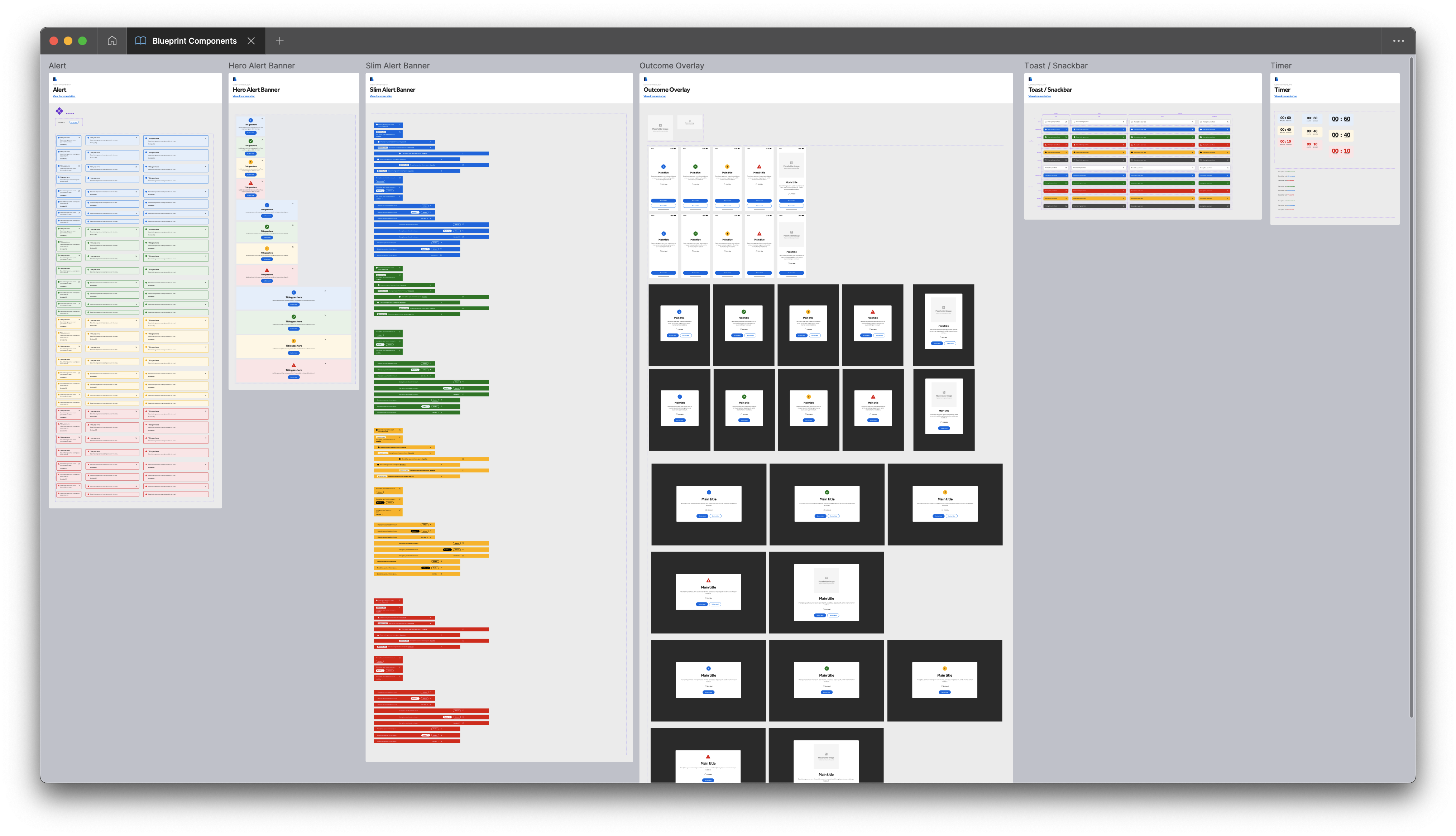
The Blueprint Components library in Figma — a sample of the 100+ components spanning alerts, overlays, notifications and interactive states
The System
Four layers.
One language.
The Barclays Group Design System was structured in four interconnected layers — each dependent on the ones below it, each serving a different audience within the organisation.
Brand foundations
The deepest layer — colour tokens, typography scale, spacing system, iconography principles, photography style, and tone of voice guidelines. The non-negotiables that every other layer depended on.
Owned by: Design system team in partnership with Brand. Changes required formal governance sign-off.
Core UI components
Buttons, inputs, cards, banners, badges, navigation patterns, modals, tooltips — the atomic and molecular building blocks of every product. Each component fully documented with usage guidance, accessibility notes, and do/don't examples.
Scale: 100+ components covering the full spectrum from micro (icons, badges) to macro (page layouts, navigation systems).
React component library
Every component shipped as a production-ready React implementation — typed, tested, and accessible by default. The library was the single source of truth for front-end teams, ensuring design and code were always in sync.
Architecture: Component-driven, with full TypeScript support, Storybook documentation, and automated accessibility testing built into the CI pipeline.
Pattern library & guidance
Above the component level — patterns for common user journeys, page templates, content guidelines, and decision frameworks for when to use which component. This was what turned a component library into a design system.
Key output: A contribution model that allowed product teams to propose and test new patterns, with a governance process to promote validated patterns into the core library.
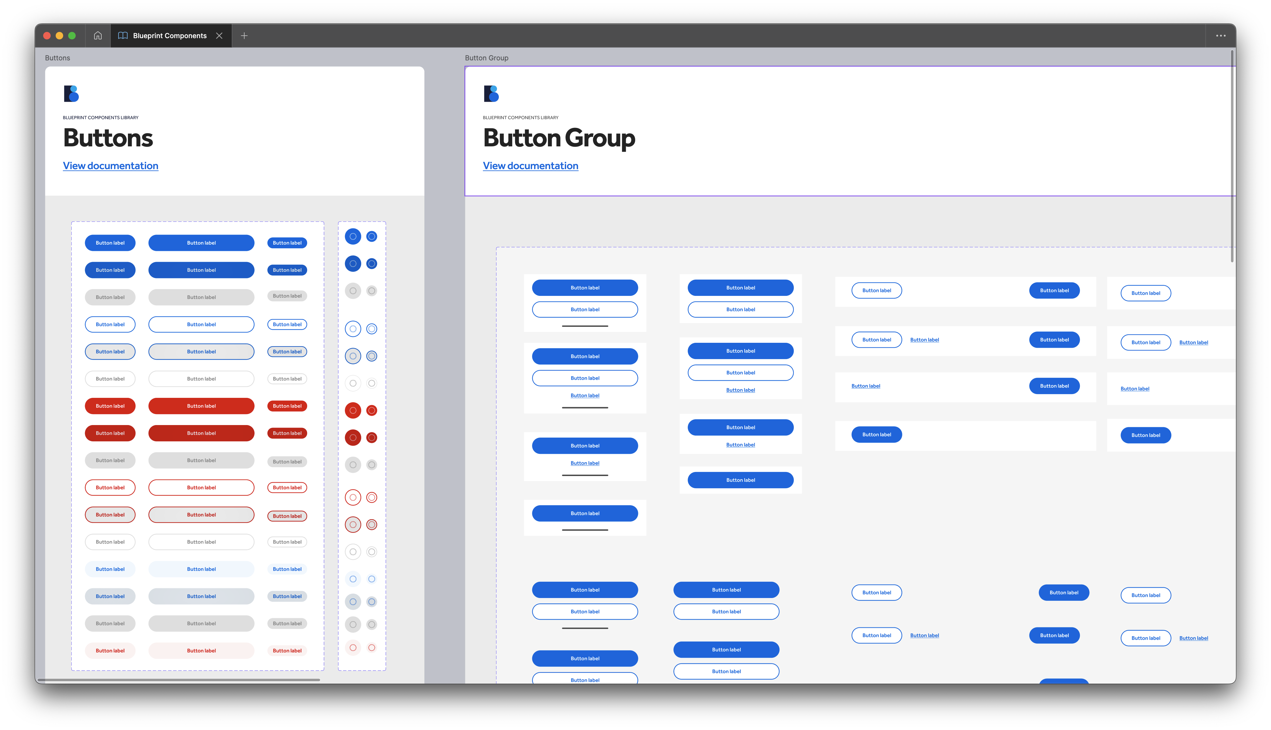
Button and Button Group components — every state, variant and size documented with usage guidance and links to the coded Storybook equivalent
The Team
Seven designers.
One shared standard.
Building a system of this scale required a dedicated team — not designers split between system work and product work, but a focused group whose entire remit was the quality and evolution of the design language.
🎨
Visual Design
Component design, visual QA, and brand token governance
📐
Interaction Design
Behaviour specs, motion principles, and state definitions
✍️
Content Design
Tone of voice, microcopy standards, and writing guidance
♿
Accessibility
WCAG compliance review, screen reader testing, audit programme
📚
Documentation
Usage guidance, Storybook, contribution model, changelog
🤝
Adoption
Onboarding, community of practice, product team partnerships
03
// Impact
A system that outlasted its creator
100+
Components in the system
React
Production component library
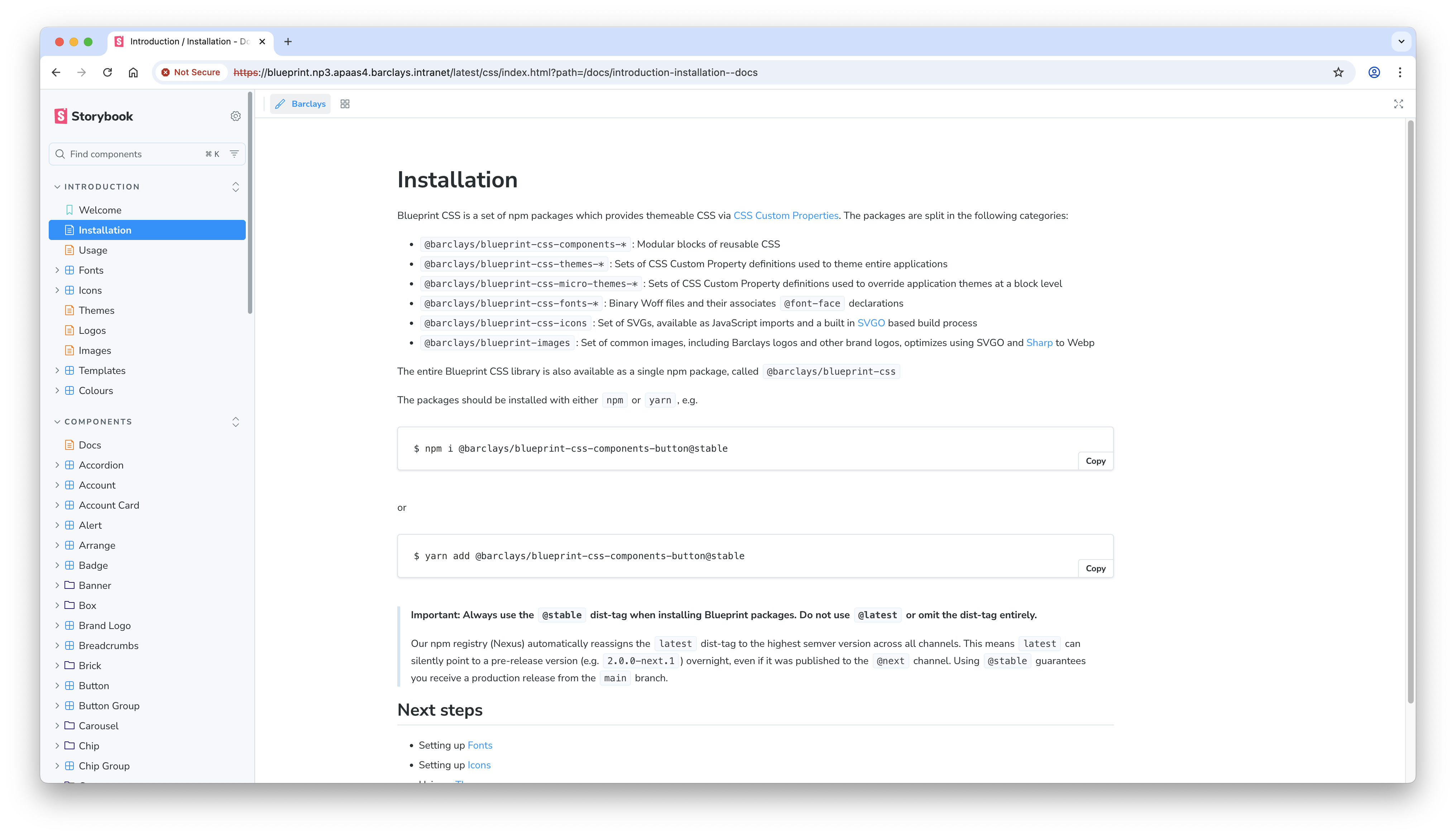
The Blueprint Storybook — the production React/CSS component library available as npm packages via the internal Barclays registry
Outcomes
What it achieved.
🏛️
A system that outlasted its creator
The strongest measure of a design system's success is whether it survives without the person who built it. The Barclays Group Design System is now owned and evolved by a dedicated central team — proof of genuine adoption and institutional value.
⚛️
Production React library
The React component library became the front-end foundation for product teams across the Group — eliminating reimplementation and ensuring design-to-code fidelity at scale.
🎯
Brand coherence across products
For the first time, photography style, typography, colour and tone of voice were governed by a single system — making the Group's products feel like they belonged to the same family.
♿
Accessibility as a default
Accessibility was built into the system rather than audited after the fact — with automated testing in the CI pipeline ensuring every component shipped at WCAG AA as a baseline.
Reflection
What a design system
really is.
A design system is not a Figma library. It's not a React package. It's not even a set of guidelines. A design system is an agreement between teams about how to work together — and the artefacts are just the tangible expression of that agreement.
Building the Barclays Group Design System taught me that the hardest problems were never technical. They were organisational. Getting teams to trust the system, contribute to it, and advocate for it internally — that was the real work.
The fact that it's still maintained and evolved by a dedicated team years later is the outcome I'm most proud of. Not the component count. Not the React library. The fact that it stuck.